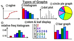

Statistical graphs are visual representations of data that help to understand and interpret trends, patterns, and relationships. Here are some common types of statistical graphs:
1. Bar Graph (or Bar Chart)
Description: A bar graph uses rectangular bars to represent the frequency or value of categories of data.Use: It is used to compare different categories or groups of data.Types:
- Vertical Bar Graph: Bars are drawn vertically.
- Horizontal Bar Graph: Bars are drawn horizontally.
Example: A bar graph showing the number of students in different grade level
2. Histogram
- Comparable to a bar graph but used to represent the distribution of numerical data.
- Groups data into bins or intervals.
- Helps identify the frequency distribution and shape of the data (normal, skewed, etc.).
Example: Distribution of student scores in an exam.
3. Pie Charts as Statistical graphs
- Shows proportions or percentages of a whole.
- Divides a circle into sectors, each representing a category’s contribution to the total. Example: Market share of different companies in a sector.
4.Line Graph
It is common when we need to show the relationship between two continuous variables over time. The x-axis usually represents time, while the y-axis represents the variable being measured.
Great for showing trends, patterns, and changes over time.
Example: Stock market prices over a year.
5.Scatter Plot
A scatter plot displays individual data points on a two-dimensional plane. The position of each point corresponds to its values for two variables.
It is used to visualize the relationship or correlation between two variables. Example: A scatter plot showing the relationship between hours studied and exam scores.
6. Box Plot (Box-and-Whisker Plot)
- Displays the distribution of data based on a five-number summary: minimum, first Quartiles (Q1), median, third Quartiles (Q3), and maximum.
- Useful for identifying outliers and the spread of the data.
Example: Examining the spread of test scores in a class.
7. Area Chart
An area chart is similar to a line graph, but the area below the line is filled with color. It is used to show cumulative totals over time. It Ideal for showing part-to-whole relationships, such as how different components contribute to a total over time.
Example: An area chart illustrating the sales of different product categories in a company.
8. Heatmap
A Heatmap is a graphical representation of data where individual values are represented by colors. The color intensity indicates the magnitude of the data. It is used to visualize complex data matrices, correlations, or trends in a visually intuitive way.
Example: A Heatmap showing the correlation between multiple variables in a data
8. Violin Plot
Each of these graphs serves different purposes. It depends on the type of data and the kind of insight you need to gain. Would you like to explore one of these in more detail or create a sample graph?
let us now consider each of the graphs mentioned in details and with relevant examples:
Cumulative Frequency Graph (Ogive)
An ogive is a graph that represents cumulative frequencies, showing the running total of frequencies in a dataset. It is used to analyze the distribution of data and determine percentiles or cumulative percentages.
Example: An ogive showing the cumulative number of students who scored below a certain threshold in an exam.
line graphs
A line graph is used to show how things change over time using a line on a Cartesian plane. It is also used to show variation of one quantity with respect to another quantity.
Line charts connect individual numeric data points resulting to simple, straightforward way to visualize a sequence of values.
Line charts are useful when viewing trends in data over time.
Example
The following shows sales in a certain store for a period of one year in terms of $1000.

Task: Draw the line graph to represent this information
Solution
To draw the line graph, we mark the months on the horizontal axis and sales on the vertical axis. The ordered pairs of a particular month and the corresponding sales is marked on the grid. For example, mark the point (Jan, 600),(Feb 500),(march,450)…….
The marked points are joined to make jointed lines as in figure below

Multiple Line Graphs
We can have two or more values that can be compared in a line graph against one quantity. For example how two products have been selling in each month.
In the above example, we would like to compare sales of two products for every month.
For example, let us consider an IT stores that sold both CPU processors and Storage Disks. We can observe sales of the two products over time on one grid. Two lines represent the trend of each particular product.

The line graph for the data above will be as shown

Note: 1 unit vertically represents $100,000 amount of sames
Practice Questions
The table below shows number of emails received by in a managers computer daily for a period of 10 days.

Required:
Represent the above information with a line a graph.
Related Topics
- Introduction to statistics
- Algebra of sets
- Measuring Lengths: Creative estimation of a tree height-1
- Line graphs
- pie charts
- Grouped and ungrouped data
- Frequency polygon
- Histograms
- Measures of Central tendency
- Mean for grouped data
- Working with the assumed mean
- Quartiles, Deciles and percentiles
- Measures of dispersion
- Variance
- Bar Graphs
Leave a Reply