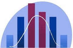

In this article, we will be discussing histograms and frequency polygons. A histogram is a plot. It lets you discover and show the underlying frequency distribution of a set of continuous data. This allows the inspection of data for its underlying distribution. The common distribution shape can be normal distribution, outliers, skewness, etc.
Continuous data refers to data that can take any value within a given range. It can be measured with great precision and includes decimal or fractional values. Continuous data is essentially infinite and allows for a smooth and unbroken spectrum of possibilities. Examples of continuous data include height, weight, temperature, and distance.
Histogram is a bar graph where the area of the bars are used to represent the frequencies. Unlike in bar graphs, there are no gaps between adjacent bars.
Unlike in bar graphs, class limits are on the horizontal axis. In a histogram, we must use the lower and upper class boundaries. These boundaries must be clearly marked on the horizontal axis with an accurate scale.
The width of each bar in histogram is proportional to the class width.
Example question on making histograms
The following are masses of some 30 patients that visited a health center in a certain day.
33 45 49 45 60 67 57 49 48 43 59 64 39 38 44
55 45 48 52 55 54 57 56 49 55 56 39 42 41 46.
- Present the information in a frequency table
- Draw a histogram to represent the information
solution
We start by first determining the number of classes required
Range = 67-33=34
A class size of 5 will give 34/5 = 6.8 ≈ 7
The frequency table will be as follow

The measurements are usually the estimates of the actual measurements. so that a measurements of 33 kg is around 32.5kg and 33.4 kg
In the above example, all classes have equal class width, hence it will be like a bar graph.
To draw a histogram, we consider the lower and upper class boundaries of each class. These boundaries become the edges of the bars.
The bars are equal in width but heights corresponds to the frequencies. The histogram is a shown.

Practice question
The frequency table below shows the measurements of girths of 30 trees in a forest in centimeters
| Class | Frequency |
|---|---|
| 60-64 | 8 |
| 65-69 | 14 |
| 70-79 | 16 |
| 80-89 | 10 |
| 90-94 | 7 |
Frequency table for girths of trees
Using a suitable scale, draw a histogram to represent this information.
After working it out, check whether your resultant histogram is like the one in figure below

n a histogram, each bar’s size shows how many times something happened in a specific range. The height alone does not tell the full story. The combined height and width of the bar give the complete picture. Height alone shows how often things occur only when all the bars are the same width. When the bars have different widths, examine both the height and the width. This helps you understand the frequency.
Difference between a bar chart and a histogram
The major difference is that a histogram is used to plot the frequency of score occurrences. It is used in a continuous data set divided into classes called bins. Bar charts, on the other hand, can be used for many different types of variables. These include ordinal and nominal data sets.
Frequency polygons
Frequency polygons are obtained by marking the midpoints of the bars used in a histogram. Then, the midpoints are joined using a straight line.
Frequency polygon can also be obtained by plotting the midpoints of the classes against the frequencies.
Example
The table below shows the masses in kilograms of some 30 pigs measured by a certain farmer.
| Class | Frequency |
| 25-29 | 6 |
| 30-34 | 12 |
| 35-39 | 8 |
| 40-44 | 5 |
We are going to use the table above to draw a frequency polygon
we need to find the mid-points of the classes because frequency should be plotted against the midpoint of the class.
The mid pints of each class is obtained by adding the boundaries together and then dividing by two.
The table below shows the class and their mid-points.
| class | Mid-point | Frequency |
| 25-29 | 27 | 6 |
| 30-34 | 32 | 12 |
| 35-39 | 37 | 4 |
| 40-44 | 42 | 5 |
frequency table with class midpoints
The resulting polygon is as shown in the figure below

Example Question
The length of 28 tree seedlings were recorded as follows in centimeters,
15 16 28 19 12 12 20 20 14 16 11 12 37 13 11
12 14 17 17 18 11 10 15 13 14 25 17 14 16 18.
(a) Make a grouped frequency table with equal widths of 4, starting from 11-14.
(b) on the same axis:
- draw a histogram to represent the data
- draw a frequency polygon
Related Topics
- Frequency tables
- bar graphs
- Grouping Data: Easy approach 1
- Set Theory
- Introduction to statistics
- Measures of dispersion
- Grouped and ungrouped data
- bar graphs
- Line graphs
- Frequency polygon
- Histograms
- pie charts
- Measures of Central tendency
- Mean for grouped data
- Working with the assumed mean
- Quartiles, Deciles and percentiles
- Measures of dispersion
- Variance
- Mathematics
Leave a Reply