
Pie charts are a circular graphs. A circle is divided into sections, each representing a frequency of an item in the data set.
A pie chart shows the relative contribution that different categories contribute to an overall total. They are used to show percentage or proportional data. The percentage represented by each category is provided next to the corresponding slice of pie. The total of all the percentages shown in the pie chart should be 100.
They are good for displaying data for around 6 categories or fewer. When there are more categories, it is difficult for the eye to distinguish relative sizes. The chart becomes hard to interpret. The chart becomes difficult to interpret.

To draw a pie chart, the total frequency is equated to the 360o angles that makes a circle. Each item’s frequency is shown by a sector of the circle. Its angle is a fraction of the total frequency.
Example : How to draw pie charts
Consider the following Data that shows the favorite game for some grade 8 students .
| Games | Number |
| Soccer | 400 |
| handball | 50 |
| Basketball | 60 |
| Volleyball | 250 |
| Athletics | 300 |
Table showing favorite games in a school
Required: Presenting this data in a pie chart
solution
We need to find the size of the sectors in our desired circle chart that will represent each frequency.
The total frequency =400+50+60+250+300 = 1060
The radius of the circle chart does not matter, it can be of any size but make sure you select the one that is most convenient and will make your char presentable.
we equate: 1060 students = 360o
the sector that will represent the soccer will be (400/1060)*360 = ~136o
sector for handball = (50/1060) *360 = ~17 o
sector for basketball =(60/1060) * 360 = ~20o
sector for volleyball = (250/1060) * 360 = ~85o
sector for athletics = (300/1060) * 360 = 102o
note that we have approximated the angles to whole numbers but when you add them they should add up to 360o . that is (136 + 17 +20 +85+102)=360.
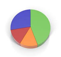
we should use the radius of the circle as a reference line from which we will draw sectors of the circle. The pie chart after you draw it should resemble the following chart

Related pages
- Introduction to statistics
- Line graphs
- Grouped and ungrouped data
- Frequency polygon
- Histograms
- Measures of Central tendency
- Mean for grouped data
- Working with the assumed mean
- Quartiles, Deciles and percentiles
- Measures of dispersion
- Variance
- Bar Graphs
- Bar Graphs: concise Introduction1
Leave a Reply