Bar graphs consist of vertical or horizontal rectangles.We draw these rectangles on a Cartesian plane. They represent a particular data item with its frequency.
Bar charts are especially effective with numerical data. This is when the data splits nicely into different categories. You can quickly see trends within your data. They are best used to:
- show change over time
- compare different categories
- compare parts of a whole.
There are two types of simple bar charts:
- Vertical or column chart –bars are moving upwards or are vertical.
- Horizontal bar chart– This is a bar chart where the bars are horizontal.
For vertical bar graphs, horizontal axis shows category of items and vertical axis the frequency.
horizontal bar graphs
For horizontal bar graphs, item categories are on vertical axis and frequency on the horizontal axis. see the figure below

Bar graphs are particularly useful in making comparison of data. The height or length of a bar graph is directly proportional to frequency. However, the width does not have numerical significance.
Consider a hypothetical data about daily visitors. They visit the first seven major stores in Washington. This is shown in the table below.

We can represent the above information on a bar graph for a more appealing visualization. A typical vertical bar graph for the above data can be as in the diagram below.

A vertical bar graph
Vertical bar graphs
If the same information could be represented using horizontal bar graph, it could appear as shown below:

Each unit in the horizontal scale represents 200 visitors
By now you may have realized that a chart has 5 important elements:
- Chart title– example: Number of visitors per day in 5 stores
- Vertical axis title-e.g. : store name
- horizontal axes title-e.g. : number of visitors
- axes labels-e.g, Amazon fresh, Food lion, Gian….
- data labels
Chart title is arguably the most important piece of a chart. It is the element that lets the audience know what your chart is about.
Your chart titles should be descriptive enough. At first glance, your audience should know what information the chart intends to give them. The title should also be brief and concise so that the graph is not cluttered.
Chart title is usually placed at the top of the chart.
Example
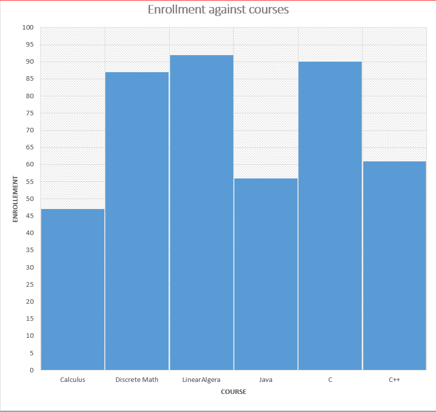
The table below shows the number of students enrolled in each course in the department of Science and Engineering at Kenyatta University on January 2024.

Draw a bar graph to show this information
solution

The vertical scale in the above chart represents 1 unit for 5 students
Multiple Bar Graphs
Multiple bar graphs are used when we have more than one category of data entities to analyze. For example performance of students in two or more subjects.
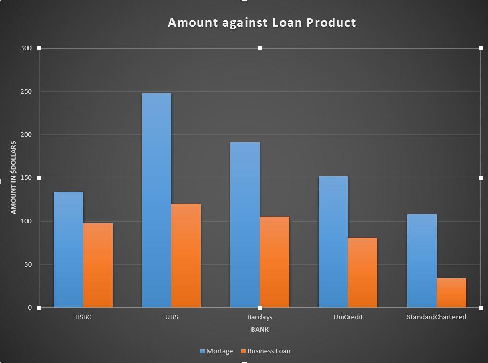
For Example compare sales value of two loan products for various banks in the last one year in million dollars as shown

Task: draw a bar graph to represent this information
Solution

In the above chart the bar blue bar shows A mortgage sales and the orange color shows business loan.
Divided Bar Charts
This type of bar chart represents two or more quantities on the same bar. One category is connected in series with the other category.
The information about bank products described above is represented as stacked graph as shown.

Practice Exercise
- The table below presents the number of female students. It also shows the number of male students. These students are enrolled in 7 courses. The courses are offered in a semester from the department of science and Technology.

Task:
- Draw a multiple graph to represent the information
- Draw a stacked graph to represent the information
- Which causes has more females compared to males
- which cause has the lowest number of participants
2. Learners in grade 4 were asked to name the breeds of dogs at their homes. Their teacher recorded their responses in the table below.

Required: Represent the data on a bar graph.
3. The results of a mathematics tests for 30 students were as follows:
43 62 33 45 56 32 34 39 51 65 32 43 33 32 43 45 46 44 33 45 51 56 35 33 34 45 32 42 43 62
Required: Make a bar graph to show this information
4. The masses of students in grade 7 and 8 were recorded as follow

required:
- draw a multiple bar graphs to represent this information
- Represent the information using a stacked graph
Conclusion
In this lesson we have discussed how to represent data Using bar graphs. Bar graphs represents data in a more intuitive way. There are various ways we can draw bar graphs. This includes:
- Vertical bar graphs
- Horizontal bar graphs
- Multiple bar graphs
- stacked bar graphs

We can compare more than one entity of data in one bar graph.
Related Topics
- The fundamental theorem of calculus
- Introduction to statistics
- Line graphs
- pie charts
- Grouped and ungrouped data
- Frequency polygon
- Histograms
- Measures of Central tendency
- Mean for grouped data
- Working with the assumed mean
- Quartiles, Deciles and percentiles
- Measures of dispersion
- 8 useful Statistical graphs
- Easy Integration4: partial fractions