
A line graph is used to show how things change over time using a line on a Cartesian plane. It is also used to show variation of one quantity with respect to another quantity.
Line charts connect individual numeric data points resulting to simple, straightforward way to visualize a sequence of values.
Line charts are useful when viewing trends in data over time.
Example
The following shows sales in a certain store for a period of one year in terms of $1000.

Task: Draw the line graph to represent this information
Solution
To draw the line graph, we mark the months on the horizontal axis and sales on the vertical axis. The ordered pairs of a particular month and the corresponding sales is marked on the grid. For example, mark the point (Jan, 600),(Feb 500),(march,450)…….
The marked points are joined to make jointed lines as in figure below

Multiple Line Graphs
We can have two or more values that can be compared in a line graph against one quantity. For example how two products have been seeling in each month.
In the above example, we could like to compare sales of two products for every month.
For example, let us consider an IT stores that sold both CPU processors and Storage Disks. We can observe and compare sales of the two products with time on one grid but with two lines, each representing the trend of a particular product.

The line graph for the data above will be as shown
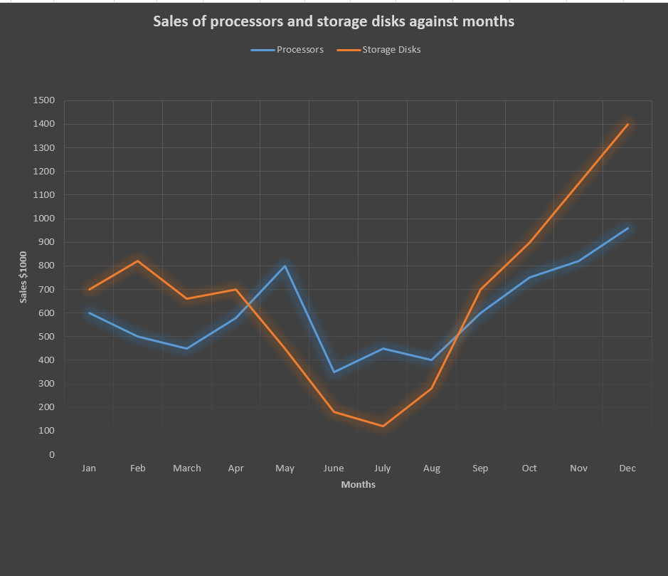
Note: 1 unit vertically represents $100,000 amount of sames
Practice Questions
The table below shows number of emails received by in a managers computer daily for a period of 10 days.

Required:
Represent the above information with a line a graph.
Related Topics
- Introduction to statistics
- Algebra of sets
- Line graphs
- pie charts
- Grouped and ungrouped data
- Frequency polygon
- Histograms
- Measures of Central tendency
- Mean for grouped data
- Working with the assumed mean
- Quartiles, Deciles and percentiles
- Measures of dispersion
- Variance
- Bar Graphs