Can you be able to get the next number? Can you write the next 20 numbers from the pattern?
There are some rules you can use to obtain the numbers in each pattern. For example in the first pattern, you can count position of the number and then multiply by 2, in other words, the nth number is simply 2n. Like 7th number is simply 2*7=14.
The second pattern is a square of the position in the number, like 6th is 36=62, and hence next number after 36 is 72=49.
A sequence or a progression is a series of numbers where each of the next number in the pattern can be obtained using some rules.
Each of the numbers in the sequence is called a term.
The rule used in the pattern ensures numbers are arranged in a definite order and the next number can always be obtained using the rule
Example
For each of the following sequences, find the next three terms.
1, 3,5,7……..
1/3, 1/9, 1/27……
1,8,27……
-3, 6, -12……
Solution
To obtain the next term, and 2 to the preceding term, hence the next term is 7+2, next 9+2, next 11+2,etc. Hence the next three terms are 9, 11, and 13.
The next term in the pattern is obtained by multiplying the preceding number by 1/3. That is, next number after 1/27 will be (1/27)*1/3=1/81, then next ones (1/81)*1/3=1/243 and next (1/243)*1/3=1/729.
In the next sequence, the next number is obtained by cubing it’s position. For instance, second number is 23 =8 and 33=27. So the next one is 43 and so on, hence the next three numbers are 64, 125 and 216.
The next number is obtained by multiplying the preceding term by -2. Hence the next three terms are 24,-48 and 96.
Example
If the nth term of a sequence is given by 2n+3, find the first, fifth and the twelfth term.
Solution
For the first term n=1. Hence substitute 1 in the above equation such that we have 2 x 1 + 3=5
For the fifth term; n=5, hence second term is given by 2 x 5+3=13
12th term is 2 x 12+3=27;
hence the first, fifth and the twelfth term is 5, 13 and 27 consequently.
Practice questions
For each sequence below, give the next four terms and the rule used
A rational number is a number which can be written in the form p/q where p and q are integers and q should be greater than zero. P and q must not have a common factor between then except 1.
Examples of rational numbers is like 1/5, 3/7, 4/11, etc.
Irrational numbers
Irrational are numbers are numbers that cannot be written in the form p/q. Irrational numbers cannot be expressed as simple fraction.
Examples of irrational numbers includes:
π √2 √3 √7 etc.
when irrational numbers are expressed as decimals, the decimals continues without end and without recurring
for example √2 = 1.414213562……… and π =3.141592654…..
surds
The roots of rational numbers that gives irrational numbers are called surds.
numbers under square-root sign that will result to a whole number after square-root operations are NOT surds.
a surd is an irrational number of the form ±√x such that ±√x cannot be written as a/b where a, b ∈ ℤ and b ≠ 0.
for example ∛64 is not surd because it will evaluate to 4 which is a whole number.
Simplifying surds
In order to simplify surds, the number under the root sign should be expressed as a product of two factors such that one factor is a perfect root.
Examples:
simplify the following
(a) √12 (b) √32 (c) √(3/4) (d) ∛250
solution
(a) We first express 12 as a product of two values, where one value is a perfect square as shown
Then we separate the two values under the root sign to have two roots multiplied such as:
we know square root of 4 is 2, but squareroot of 3 is irrational, hence we write:
and finally we remove the multiplication sign X to have
(b) 32 can be expressed as a product of many factors:
2x 16
4 x 8
2 x 2 x 2 x 2 x 2 = 25
we write 24 x 21
24 is a perfect square and so we can it can be simplified when inside the square-root sign.
however, the shortest way is to get the root of 16 and root of 2 because root of 16 exists and square-root of 2 is irrational. hence we write
square-root of 16=4 and squareroot of 2 is irrational, hence we have:
(c) here were are looking for square-root of resultant quotient from dividing 3 and 4.
but we can as well get the same result by dividing root of 3 with root of 4 as shown:
and this can be simplified to:
(d) This problem requires us to find the cube-root of 250. There is no whole number that can be a cube-root of 250.
factors of 250 includes:
10 x 25
5 x 50
125 x 2
but 125 = 5 x 5 x 5 = 53
hence we can express cube-root of 250 as the cube-root of the product 2 x 125.
In statistics, data items can be considered as a group instead of considering an individual item especially when the number of records are huge.
In grouping, you take few neighboring items and put them in a group, for example if you have items like 41,42,42,43,45,46, you can decide to consider a group of 41-45 instead of listing the numbers individually.
Let us consider the data provided below that represents ages of some 20 senior workers in a company:
We can reduce the size of the table by grouping the data in 5 values as shown. please note that we have changed the first column from age to class meaning it will represent a class of a certain age group.
class
Tally
Frequency
51-55
//// ///
8
56-60
////
5
61-65
////
5
66-70
//
2
Total
summation
20
Grouped data for senior workers in a company
Measurements such as height, mass, age, time e.t.c are usually estimates of the actual values therefore any value between 50.5 and 51.4 could be estimated as 51. Therefore we can write interval x as 50.5 ≤x< 51.5.
A class interval 51-55 includes all masses between 50.5 t0 55.5
The values 50.5 and 55.5 are called the class boundaries of the class 51-55.
50.5 is the lower class boundary in this case and 55.5 is the upper class boundary.
The difference between the class boundaries is the class width(class size). For example in the example above, class width =55.5-50.5 = 5
when grouping data, ensure the groups are not so many, the most recommended is 5-12 groups.
practice question
The data below shows masses of 30 animals in animal farm.
(b) represent the grouped data in a bar graph and then in a pie chart4
Solution
The first step is deterring the number of classes. This we do by determining the range and the size of each group. let say each group should have n items and the range is R.
The number of groups (classes=R/n) approximated to the nearest whole number that is greater than R/n.
the range is the difference between the highest score and the lowest score. In the above data, the range = 43-24 = 19
Assuming we want each class has five items, then number of classes = 19/5≈3.8 which should be 4 to the nearest whole number. however we said the best numbers is between 5-12. hence we can reduce the number of items per group, probably to 4.
hence 19/4 = 4.75 classes ≈5
five classes are better than four because fewer number of items in a group can increase accuracy when calculating the measures of central tendencies.
the groups starts from the lowest value, and then add 3 items to get the upper boundary of that group. Note we have added 3 and not 4 because the lower boundary need 3 more items to make 4 items in the group.
The frequency table for the grouped data should be as follow
classes
Tally
Frequency
24-27
//// ////
9
28-31
//////// //
12
32-35
////
4
36-39
/
1
40-43
////
4
Total
summation
30
Frequency table for masses of animals in a farm
The data can be represented in the in a bar graph as shown
Practice question
The marks obtained by students in a Java test were recorded as follow
Pie chart is a circular graph where a circle is divided into sections each representing a frequency of each item in the data set.
A pie chart shows the relative contribution that different categories contribute to an overall total. They are generally used to show percentage or proportional data and the percentage represented by each category is provided next to the corresponding slice of pie. The total of all the percentages shown in the pie chart should be 100. They are good for displaying data for around 6 categories or fewer. When there are more categories it is difficult for the eye to distinguish between the relative sizes of the different sectors and so the chart becomes difficult to interpret.
To draw a pie chart, the total frequency is equated to the 360o angles that makes a circle. So the frequency of each item is presented by a sector of the circle whose angle is a fraction of the total frequency.
Example
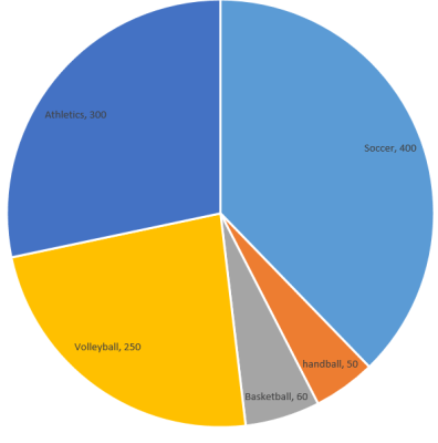
Consider the following Data that shows the favorite game for some grade 8 students .
Games
Number
Soccer
400
handball
50
Basketball
60
Volleyball
250
Athletics
300
Table showing favorite games in a school
Required: Presenting this data in a pie chart
solution
We need to find the size of the sectors in our desired circle chart that will represent each frequency.
The total frequency =400+50+60+250+300 = 1060
The radius of the circle chart does not matter, it can be of any size but make sure you select the one that is most convenient and will make your char presentable.
we equate: 1060 students = 360o
the sector that will represent the soccer will be (400/1060)*360 = ~136o
sector for handball = (50/1060) *360 = ~17 o
sector for basketball =(60/1060) * 360 = ~20o
sector for volleyball = (250/1060) * 360 = ~85o
sector for athletics = (300/1060) * 360 = 102o
note that we have approximated the angles to whole numbers but when you add them they should add up to 360o . that is (136 + 17 +20 +85+102)=360.
we should use the radius of the circle as a reference line from which we will draw sectors of the circle. The pie chart after you draw it should resemble the following chart
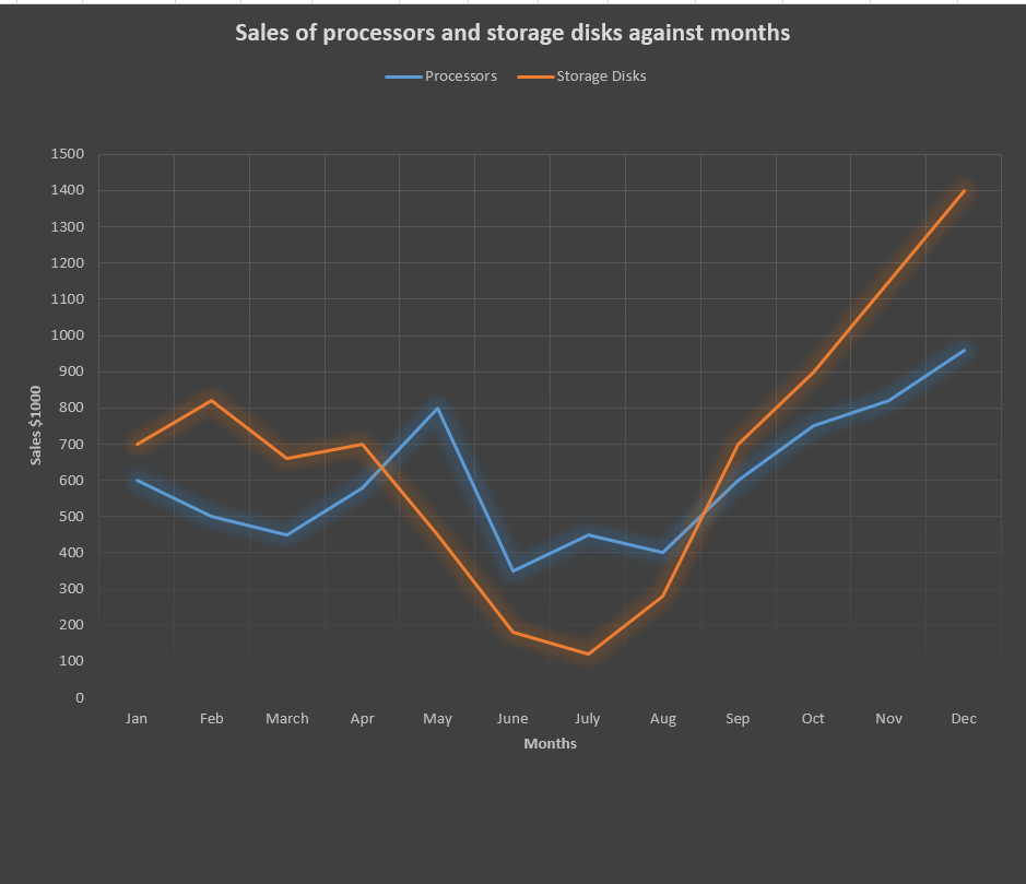
A line graph is used to show how things change over time using a line on a Cartesian plane. It is also used to show variation of one quantity with respect to another quantity.
Line charts connect individual numeric data points resulting to simple, straightforward way to visualize a sequence of values.
Line charts are useful when viewing trends in data over time.
Example
The following shows sales in a certain store for a period of one year in terms of $1000.
Task: Draw the line graph to represent this information
Solution
To draw the line graph, we mark the months on the horizontal axis and sales on the vertical axis. The ordered pairs of a particular month and the corresponding sales is marked on the grid. For example, mark the point (Jan, 600),(Feb 500),(march,450)…….
The marked points are joined to make jointed lines as in figure below
Line graphs for sales against month
Multiple Line Graphs
We can have two or more values that can be compared in a line graph against one quantity. For example how two products have been seeling in each month.
In the above example, we could like to compare sales of two products for every month.
For example, let us consider an IT stores that sold both CPU processors and Storage Disks. We can observe and compare sales of the two products with time on one grid but with two lines, each representing the trend of a particular product.
The line graph for the data above will be as shown
Multiple linear graphs for sales of processors and storage disks
Note: 1 unit vertically represents $100,000 amount of sames
Practice Questions
The table below shows number of emails received by in a managers computer daily for a period of 10 days.
Number of emails received by a manager
Required:
Represent the above information with a line a graph.
Bar graphs constitutes vertical or horizontal rectangles drawn on a Cartesian plane in order to represent a particular data item with it’s frequency.
Bar charts are especially effective when you have numerical data that splits nicely into different categories so you can quickly see trends within your data. They are best used to:
show change over time
compare different categories
compare parts of a whole.
There are two types of simple bar charts:
Vertical or column chart –bars are moving upwards or are vertical.
Horizontal bar chart– This is a bar chart where the bars are horizontal.
For vertical bar graphs, horizontal axis represents category of items and vertical axis the frequency.
For horizontal bar graphs, item categories are on vertical axis and frequency on the horizontal axis. see the figure below
Bar graphs are particularly useful in making comparison of data.The height or length of a bar graph is directly proportional to frequency but the width does not have numerical significance.
As an example consider a hypothetical data about daily visitors that calls in in the first seven major stores in Washington as in table below.
We can represent the above information on a bar graph for a more appealing visualization. A typical vertical bar graph for the above data can be as in the diagram below.
A vertical bar graph
If the same information could be represented using horizontal bar graph, it could appear as shown below:
Horizontal bar graph
Each unit in the horizontal scale represents 200 visitors
By now you may have realized that a chart has 5 important elements:
Chart title– example: Number of visitors per day in 5 stores
Vertical axis title-e.g : store name
horizontal axes title-e.g : number of visitors
axes labels-e.g, Amazon fresh, Food lion, Gian….
data labels
Chart title is arguably the most important piece of a chart.It is the element that lets the audience know what your chart is about.
Your chart titles should be descriptive enough such that, at first glance, your audience knows what information the chart intends to give them. The title should also be brief and concise so that the graph is not cluttered.
Chart title is usually placed at the top of the chart.
Example
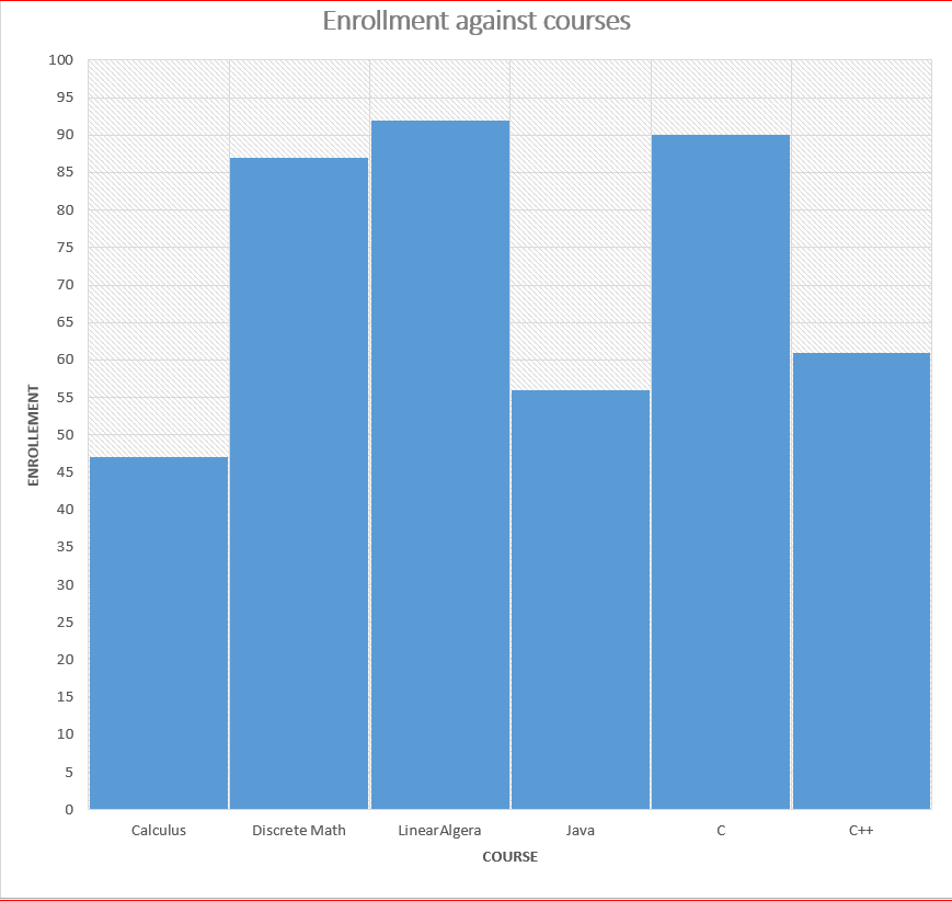
The table below shows the number of students enrolled in each course in the department of Science and Engineering at Kenyatta University on January 2024.
Draw a bar graph to show this information
solution
Vertical bar chart showing relationship between enrollment and course
The vertical scale in the above chart represents 1 unit for 5 students
Multiple Bar Graphs
Multiple bar graphs are used when we have more than one category of data entities to analyse. For example performance of students in two or more subjects.
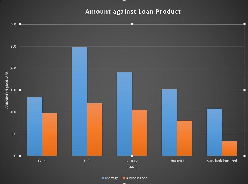
For Example compare sales value of two loan products for various banks in the last one year in million dollars as shown
Task: draw a bar graph to represent this information
Solution
Multiple bar graphs
In the above chart the bar blue bar represents A mortgage sales and the orange colour represents business loan.
Divided Bar Charts
This are bar charts that represents two or more quantities on the same bar where one category is connected in series with the other category.
The information about bank products described above could be represented as stacked graph as shown.
stacked bar graphs
Practice Exercise
The table below shows the number of female and male students enrolled in 7 courses offered in a semester from the department of science and Technology.
Task:
Draw a multiple graph to represent the information
Draw a stacked graph to represent the information
Which causes has more females compared to males
which cause has the lowest number of participants
2. Learners in grade 4 were asked to name breed of dogs at their home and their teacher recorded their response in the table below.
Required: Represent the data on a bar graph.
3. The results of a mathematics tests for 30 students were as follows:
Required: Make a bar graph to show this information
4. The masses of students in grade 7 and 8 were recorded as follow
required:
draw a multiple bar graphs to represent this information
Represent the information using a stacked graph
Conclusion
In this lesson we have discussed how to represent data Using bar graphs. Bar graphs represents data in a more intuitive way. There are various ways we can draw bar graphs. This includes:
Vertical bar graphs
Horizontal bar graphs
Multiple bar graphs
stacked bar graphs
We can compare more than one entity of data in one bar graph.
2. –>The most common score is 14 as it has the highest number of repeats
3. –> 10, because there are 10 values above 14
4. –> largest value=27, smallest value=12, 27-12 = 15
5. answers in number 4 shows how the data values are distributed. it represents the range at which scores have spread. in the above question, the data spread across 15 values
Statistics is the science of data collection, organization, representation and interpretation of data or information.
Please note the difference between statistics and statistic.
Statistic
Statistic is a collection of information shown in numbers. For example the number of people that browse a a web in a day is a statistic.
Data
Data is used to mean fact or information which needs examination or processing in order to extract useful information. For example counting the number of people in a location is data collection. Data collection may be described as gathering of facts that may be used for information processing.
Examples of data collections may include:
The number of items sold per category of items sold in the supermarket
The number of crimes or cases reported to a police station daily
The average fuel consumption of a country in a month
Number of people infected with HIV virus per day
The average rainfall of an area over a given period
Data representation
Data collected should be presented in a way that is most useful to the consumer meaning it should be represented in a way that is convenient and easy to understand. Data that is well represented will be understood and be interpreted easily.
Some of the methods used to represent data includes
Listing the data in a chronological order
pictograms (picture graphs)
bar charts
pie charts
histograms
Frequency tables
Listing of data
Listing data is simply putting down the actual numbers representing a quantity of an item in a data set. for example consider a class of 20 students that are in a computer science class that sits for a test and scored the following marks in percentage:
Above represents a list of marks as recorded by the teacher from the students scripts. There is nothing much we can do with a list of numbers, but we can make the list more meaningful by arranging the items in ascending or descending orders.
From the ordered list, one can determine the highest value, smallest value, a value that is repeated most of times and the value that is at the middle.
If you can consider the data above, it’s ordered list will be as follow:
As you can see from the list, the lowest value is at the beginning of the list and the largest value is at the end of the list.
Please note that the value that are repeated are placed next to each other.
To get to the middle we simple divide the list size by two. for example in the above list, to get to the middle we simple gets a value between 10th and 11th position. We will be talking more about the mid value in the upcoming lessons.
Exercise 1
Marks scored in an English test by a group of 17 students were recorded as follows out of 30 possible marks.
Frequency means the number of times a value is recorded or observed. It means the count of a particular value in a data set.
While counting the scores, a tally mark / is made for every occurrence of an item and every 5th occurrence is stroked across the other four ////. The result of tallying is placed on a table with the value making one column, tallying another column and the frequency another column. From the table, much more manipulation of data can be done, but we are likely to see that in other lessons.
We will make a table of three columns and in the first column we list every unique value that is represented in the data . The second column we will put the tallying and the third column we put the result of the tallying
Mark
Tallying
Frequency
49
/
1
55
//
2
56
/
1
59
/
1
60
//
2
61
//
2
62
/
1
64
/
1
65
/
1
67
//// /
6
68
/
1
70
/
1
73
////
5
74
//
2
76
/
1
78
/
1
79
//
2
80
//
2
82
//
2
83
//
2
Total
37
A frequency distribution table
Exercise 2
The following are scores in a math class for 21 students :
Contains information related to marketing campaigns of the user. These are shared with Google AdWords / Google Ads when the Google Ads and Google Analytics accounts are linked together.
90 days
__utma
ID used to identify users and sessions
2 years after last activity
__utmt
Used to monitor number of Google Analytics server requests
10 minutes
__utmb
Used to distinguish new sessions and visits. This cookie is set when the GA.js javascript library is loaded and there is no existing __utmb cookie. The cookie is updated every time data is sent to the Google Analytics server.
30 minutes after last activity
__utmc
Used only with old Urchin versions of Google Analytics and not with GA.js. Was used to distinguish between new sessions and visits at the end of a session.
End of session (browser)
__utmz
Contains information about the traffic source or campaign that directed user to the website. The cookie is set when the GA.js javascript is loaded and updated when data is sent to the Google Anaytics server
6 months after last activity
__utmv
Contains custom information set by the web developer via the _setCustomVar method in Google Analytics. This cookie is updated every time new data is sent to the Google Analytics server.
2 years after last activity
__utmx
Used to determine whether a user is included in an A / B or Multivariate test.
18 months
_ga
ID used to identify users
2 years
_gali
Used by Google Analytics to determine which links on a page are being clicked
30 seconds
_ga_
ID used to identify users
2 years
_gid
ID used to identify users for 24 hours after last activity
24 hours
_gat
Used to monitor number of Google Analytics server requests when using Google Tag Manager